NOTE: This essay was originally posted as the second Designer Diary on the John Company: Second Edition Board Game Geek page
I finished the files to Pax Pamir: Second Edition around Christmas in 2018. I remember this mostly because I had hauled my desktop computer with me on our yearly trip back to the Midwest to see family. During the early mornings, while my kids were still sleeping, I worked on the files, hammering them into shape. Thankfully there wasn't much work to do. Things had gone mostly according to schedule, and all of the files had been sent to the factory by the time I had to drive home.
:strip_icc()/pic6067691.jpg)
There's almost no better feeling in the world than having a long drive ahead of you and no pressing obligations. When I was grad school, Drew and I would frequently have design jams while driving back from Texas after finishing some big project. This time he wouldn't be joining us on the drive back to Minnesota, but I remember calling him and chatting about the new edition of John Company. I had planned on taking a little break after we finished Pamir, but it only took a short conversation about John Company to set me on my way. By the time I we finished the drive, I had a pretty good idea of how I wanted to approach the problem.
As with the second edition of Pax Pamir, I wanted to focus my efforts on a few key areas. First, I wanted to improve the game's visuals and physical usability. There was so much about the first edition that made the game harder to play than it needed to be. Second, I wanted to put a lot of development resources behind balancing the game's different scenarios and fine-tuning the game so that it scaled better across different player counts—this included finding a solo designer to help me with an improved one and two player game. Finally, I wanted the expand the game's expressive range and immersive power. This was a most complicated objective. It meant adjusting the game's physical presentation and potentially revising many of the game's core systems.
Initially, it seemed like it would be possible to accomplish many of these objectives with minor adjustments that might even allow owners of the first edition to play the second with only a small update kit. For most of 2019, Drew and I worked under that goal, attempting to limit our intervention where possible. However, by late 2019, it was becoming clear that this approach would not take the design where we wanted it to go. By that point, the new edition of Pamir had been in the wild and was winning accolades. We knew that whatever game we did next had to match or exceed Pamir's quality. As much as we loved the first edition of John Company, it just didn't measure up.
So, as the new year began, Drew and I swung for the fences. We stopped worrying about being careful and instead started thinking about the design holistically within the context of those three development goals. We soon realized that meeting those goals required designing a board from scratch.
In the case of Pamir, the redesign of the game card was the central visual challenge of the new edition. So much about what the second edition does can be found by comparing the design of those game cards. In John Company, the same exercise can be performed in the case of the game's board. No single element of the game has been transformed to the degree the board has been transformed. And, in that transformation you can see the articulation of the ethos that informed the new edition's development.
Stuck in the Past
In the beginning, we tried a wide range of approaches, including experiments with an explicitly on old Victorian board games.
:strip_icc()/pic6067706.jpg)
I started by blocking things out in Illustrator to get a feel for the board. This design had merits, but it placed far too many constraints on our redevelopment. Our desire to make the game look a certain way was putting severe constraints on the kinds of graphic design strategies I could use to make the game easier to understand.
:strip_icc()/pic6067708.jpg)
For months we bounced from one oddball board design to another. This was a pretty frustrating time. Often Drew would come up for a visit on the weekend and we'd end the visit will a less complete game than when he arrived. It didn't help that Oath was in full swing and sometimes I commandeered our visits and asked Drew to help me with Oath's playtesting.
I think a key problem during this phase of the design was that I was trying to solve every game design and graphic design problem at the same time. I was thinking about this game as if it were something like Oath, where every little system is connected to every other bit. If I change one core element of Oath, I'd have to revisit a couple dozen cards and problem a few other critical rules, which in turn would lead to other revisions. It was an exhausting thing to build.
John Company is a very different kind of game. Though everything is connected, the game is far more compartmental. It's possible to work on one system of the design in relative isolation. This was an important advantage that I was ignoring. Instead of trying to fix the entire design with a single masterstroke, I needed to slow down and build the game more deliberately.
From Scratch
In the early spring of 2020, right before the pandemic hit, Drew came up for a visit, and we switched approaches. We built a strong sequence of play as a foundation and then put up the scaffolding for the design. If a part of the design didn't work, we put in a placeholder and moved on. The key thing was to give the game a strong, rigid frame. Our method here was really simple. Without thinking too hard, we just began going through each phase and system in the old system and roughly blocking out how a new game would approach that space. We didn't try to be too cute with the design. A clever idea can kill a design just as easily as it might save one.
This approach bore fruit immediately. Within a few hours, we had a workable new design for the game and the board. It wasn't brilliant or beautiful, but it was strong. Though it was less than a day old, it already felt more substantial than anything we had produced in the previous ten months.
:strip_icc()/pic6067709.jpg)
With the board, we tried our best to address the first area of the design. The game's original board contains a lot of information. Back when I was working on the first edition, I was so delighted to have a board that I wanted to make use of every square inch of its space. While I'm sure I had the best of intentions, I didn't appreciate how such a dense piece of graphic design could wreak havoc on the board's visual hierarchy.
:strip_icc()/pic3570066.jpg)
Sometimes graphic designers and illustrators talk about having places for the "eye" to in a design. Well, this design was the visual equivalent of a triathlon. Not only was there no place to rest, you were constantly having to change your way of seeing to understand everything that was going on. Nothing flows easily. Paradoxically, what the board needed was a much less complicated visual hierarchy. I needed the design to be "flatter." To this end, the first thing I started doing was pulling off helper text that could be made self-evident in other ways. Often this meant offloading some of that complexity on to the game's new office cards which could use short text explanations.
Cutting the Hiring Ribbon
The office cards also allowed me to get rid of the hiring ribbon. When an office was vacated, players could just flip it over and put it on the vacant offices stack in numerical order. This ensured that hiring would always proceed smoothly and without players needing to cross reference any hiring charts. It also allowed me to build a much more sophisticated hiring system.
In the original game I grouped employees of the Company into three groups: junior, senior, and executive. This grouping was done mostly to streamline the hiring process. But, in practice it didn't do much good and the groupings erased a lot of detail. With the new card system, I had a lot more room to work. For instance, when picking a new President, in the second edition players select from any writer or governor located in that Presidency. This gave the writers a much firmer sense of place and the Presidents a better sense of jurisdiction.
/pic6067756.jpg)
Because of how many candidates there would be for any particular position in the first edition, it was common for the company to feel less like a tree than a conveyer belt. It also meant that the game's promise economy was fully cashed out too frequently and that players could get what they wanted mostly by just waiting around. Though this increased the game's complexity marginally, in practice the increase was often experienced as a simplification because the relevant details were offloaded to the backs of office cards.
A Map for the Board
I still wasn't sure what to do with India. In this cut, I created a small event map that could be used to show the current political status of the various regions of India. Each region also still had an order card which would float in the three Presidency boxes.
My thinking here was that the first edition was simply too messy. The original board didn't really have space for ships on the board and frequently things would sorta spill over. I hoped that by giving big presidency boxes, players could keep their play area more organized. This is a very important thing for a game as freewheeling as John Company.
This proved to be something of a dead-end. While the political map worked fine, the order cards were still a mess. In retrospect, I think I was still trying to protect some of my ideas from the first edition. I should have been thinking about the problem from the ground up.
This wasn't my only dissatisfaction with the region cards. I had always hated how abstract they made India. Even for those involved in the Company at this time, India was more than a series of disjointed opportunities. I wanted this new board to ground the players in the subcontinent and hopefully help them connect the game's event system (which I'll talk about in a future post) with the realities of trade and the Company's increasing footprint in southern Asia.
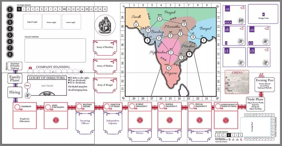
When I stepped back and thought about it as a graphic design problem, the core issue and solution were obvious. Players had a hard time building a sense of geography and situating the game elements on it. This meant that I had to do the work for them. The game just needed a map, preferably a big one.
:strip_icc()/pic6067771.jpg)
I atomized the region cards and arranged the game's many orders onto a map of India. This allowed me to revisit the sequence of play and how the Presidencies were handled so that players could better understand their various spheres of influence. There were lots of fringe benefits as well, including the fact that ships could finally be placed on the water. (This may seem small, but it goes a long way in helping the game tell its story and helping players internalize the games systems.)
The basic gameplay logic of trade in India remained. Presidents would still make a trade check and subtract a die for each region outside of their home region. The number of ships associated with a President would indicate their overall trade bandwidth. Now, however, players could see the various trade options at a glance.
The system also allowed me to better contextualize the different jobs within the company. For instance, Presidents would place writers on orders to mark that they had been filled. This placement shows the junior nature of their position (they are being placed by a superior officeholder) and it also showed players the kind of work that a company writer would actually do. That is, they would go out to India and serve and attempt to secure goods for trade.
The board still had a long way to go, but as soon as we started working with the large map version it the whole design began to snap into focus. Instead of having to rebuild the design from scratch each time we wanted to add something, the board served as a kind of visual outline that kept us on task.
:strip_icc()/pic6067773.jpg)
In certain respects, the current board is a more complicated visual object than the first editions board. This is because the new board tries to give each gameplay element equal weight. In the previous board, very critical amendments were made small and many others were simply hinted at.
Perhaps one place where this is most clear is the sequence of play. In the previous edition, there were only 4 phases (family, company, trade, and evening post). However, many important actions were buried within that phase structure. With the new edition, I blew out the 4 phases to 10 by attempting to lift items of equal weight out of lower positions in the game's design hierarchy. Hiring, for instance, is now it's own phase. The Evening Post phase, formerly the end of the turn, now occupies three phases (Events in India, Parliament, and the London Season).
These adjustments go a long way in making the game digestible for new players and easier to run for experienced players trying to teach a group for the first time. Though John Company presents players with a massive sandbox to play in, new players will find the game much easier to learn than some of my other games simply because the game presents itself in little bite-sized chunks. If you get lost just resolve the phase and move to the next one. Usually by the end of the first couple of turns players will find their sea legs.