
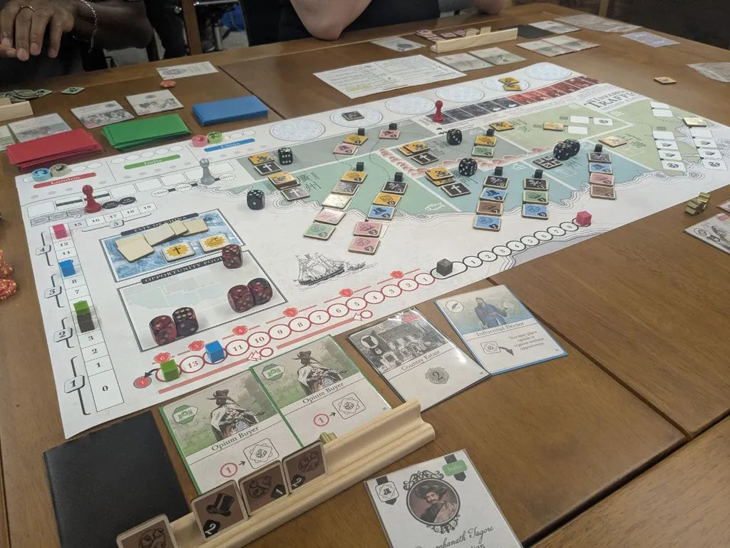
Tomorrow, we’re launching our campaign for An Infamous Traffic. It’ll be awhile before I’m able to write about the game at length. It turns out campaigns are a lot of work! However, I’ll be sure to write some capstone diaries about the game’s final development in the coming months.
Today I want to talk a bit about the game’s physical production and the general approach that Drew and I have taken to developing the look of our games over the past several years. I also want to talk about how that approach has slowly shifted from the first iterations of Pax Pamir to our work on An Infamous Traffic and beyond.
An Economy of Thrift
The fact that I make my living selling upscale historical games is always a little funny to me. Anyone who knows me personally knows that I’m a pretty cheap person and most of the games I own are pretty beat up.The other day my neighbor flagged me down while I was on a run. I brushed back my headphones and asked him what the matter was. He looked me up and down and inquired simply, why was I jogging with a lamp? Frankly, I had forgotten I was holding it. When I dropped my daughter off at school that morning I had noticed a little wooden lamp on the side of the road. I figured I’d swing by that house again after I finished my morning run and grab it if it was still there. I suppose I’m still an undergraduate at heart!

I think this ethos basically extends to all of my work on art direction and product design. I am forever looking for a deal—a discarded bit of design, a beautiful book that’s just entered the public domain, or an intriguing little component that might work for something else. Once you start to look for it in my games, you’ll see this yard sale mentality everywhere.
For instance, consider Pamir’s coalition blocks. These are probably the most consistently praised component of any game I’ve never worked on, except, perhaps, for Root’s cat warrior. When working on the first edition of the game, I knew I wanted pieces that could quickly indicate two different states. I had originally imagined large octagons, a little like the ones you find in a game like Puerto Rico, but scaled up to be a bit more stately. For a variety of cost reasons though we had to use cylinders in the first edition of Pamir, which more-or-less defeated the purpose of making them tall at all. In retrospect, it seems absurd that we had to make this cost consideration, but 2015 was a very different time in the game industry and Sierra Madre Games was certainly not a normal publisher.
When I started working on Pamir’s second edition, I began with those blocks. But, I had a problem. Rectangular prisms like those I was imagining were basically never used in games. Catan roads were much too thin. Without a good proxy, I didn’t have a sense of what I should use to establish the game’s base unit.
I don’t know if this term is used widely, but what I mean here is the elemental piece that is used to determine the overall look and feel of a game. Everything about a game should be scaled around this base unit. So, a scrabble tile determines the size of the rack and the board itself. Or, for a more far reaching example, consider a token in an 18xx game. This token determines the size of the stock chart and also the size of a station space on a track hex which, in turn, determines the size of the hex and the board itself. Ideally the base unit should be pleasant to handle and easy to place precisely. In this same way the physical design of a complex euro springs out from the shape and feel of an 8mm cube.

When looking for a base unit for a game, I often draw from traditional games. Those older games are filled with generations of best practices and ludic traditions that are ripe for reuse and iteration. Even the smallest details of their design are worth paying attention to. One of my favorite examples in this are dice. If you present someone with a range differently sized six-sided dice, you’ll find them gravitate towards the 16mm die. Its weight feels consequential and it’s easy to handle. Sometimes I’ll see folks make their games deluxe with 20mm dice or larger which are quite frustrating to roll. You can get away with a small handful (a casino die often used in a game like craps is 19mm), but a big handful of more than 5 is going to often lead to spillage.
So, when determining a base unit, I try to think about these little platonic ideas. And, in the case of Pamir, I actually used a die as the game’s base unit. I bought a heap of blank dice and spent an afternoon assembling little stacks of two with the help of a little super glue and then spray painted the dice.
Now this felt right. They were nice and heavy to handle and clearly displayed their orientation. Almost all of the physical playtests of Pamir were played using those blocks. And, when it came time to learn a bit of 3d modeling and design the actual production blocks, I basically just replicated what I had already made by hand. The final coalitions blocks were 16x16x32. Exactly the same size as two stacked standard dice.

Thinking About Tiles
When I started working the production for the second edition of An Infamous Traffic, I began with the tiles. I knew these would be central to the game’s look.
My first impulse was the model them off of Mahjong tiles. Like most games, Mahjong has a pretty long and tangled history dating back to some of the earliest evidence we have for card-based games way back in the Tang Dynasty over a thousand years ago. Like most card games, the design grew out of many different card games and demonstrates a wide range of influences. Early version of Mahjong were probably played with cards, but, in the late 19th century you start to see sets with hand-painted tiles made from bamboo or ivory. These tiles largely resemble what we think of as modern Mahjong.

This is a little out of period, but not dramatically so. Because of the variety of materials in early sets and of games like it, it seemed like a good fit for the game. However, the tiles presented an immediate problem for the game’s design. The original counters in an Infamous traffic were quite busy. There was nothing unusual about this—An Infamous Traffic was being published by a company that, at that point, had only published wargames. It didn’t even occur to me that these little counters would be considered cluttered.
With the benefit of an additional decade of experience in production design, I knew those busy design would simply not look good if printed on wooden or acrylic tiles, let alone doing custom molds like Hive pieces. So, spent some time working on the design itself. Before deciding on the material, I needed to figure out exactly how much information a tile could hold.

In the original game, each tile featured a price (in the small shaded box) and then 3 or 4 price points (in the corners). I was never totally happy with this presentation. The biggest problem was just that they were so visually busy. With a bit of practice, players could easily see the active values, but, at a glance, it wasn’t always so clear. The game also never underwent any kind of formal usability testing. In the years since, I had seen players commonly misplay tiles, placing them at an orientation that was correct for them but which was out of alignment with the rest of the table. In most game’s this doesn’t cause any trouble. I don’t really care which way tiles in Tigris and Euphrates are facing. But, in the context of a game like An Infamous Traffic, a mistake in tile facing could totally disrupt the game.
I went through several efforts to fix this. I tried pulling off the values from tiles entirely and instead using little poker chips stacked on tiles to indicate price. This was promising but required much larger tiles, which, in turn, ballooned the physical size of the game. Here was that “base unit principle” at work. Tiles were very clearly the base unit of the game. I had to pick a base unit that handled well and clearly displayed the game-critical information. I had in my mind the Mahjong tile, domino, or a scrabble tile. I wanted something that felt thick and consequential but could also be easily manipulated. All of my adventures in stacking chits had been too clever for their own good. I needed to get back to basics.
The fundamentals of the problem were actually pretty clear. Each tile needed to demonstrate three things with absolute clarity: its owner’s color, it’s type, and its value. So, I attacked the problem head-on and drew up a simple set of tiles for each player, with just 1 or 2 tiles of each of the possible values for each player.

Of course this required sacrificing detail and flexibility. For instance, players could no longer crank all of their tiles to the maximum value. But, in reality these situations were incredibly rare. It was more likely all of a player’s tiles would slowly be lowered throughout the game. When viewed from this vantage point, the limited tile pool actually did some good work. It meant that players could protect themselves from underselling by watching where other players placed their low value tiles.
The first tests of this simplified system worked really well. As I mentioned a few weeks ago, initially I actually had players draw built tiles randomly from personal supplies. But, testing soon revealed this to be a false start. Selecting the right price for a tile is a critical skill, and it needed to be the game. But, what about flexibility? In the first edition, you could set your tiles value at whatever you liked when you placed it. This was clearly too much leeway.
Here the game’s new round structure provided the solution. I added a new action to the game that allowed players to adjust price, swapping a current tile that wasn’t in an active chain for another tile from their supply of the same type. However, you could only increment a tile +1 or -1 with each action. This meant a big pricing error could cost a player many more actions than a minor adjustment. And, in practice, it let the small set of tiles feel like it had the dynamic range of the old flexible tiles.
There were other problems that needed attended to though. The first one was the hidden nature of each tile. At this point I was playing on kits that used tiles basically the same size as scrabble tiles. So, I found myself using scrabble racks which, incidentally are pretty cheap to buy in bulk. The racks had loads of problems though. The biggest of these is that they obscure the tile type. In the preview and review kits we sent out for this campaign, I include a big note in the rules that reminded players that the type of each tile held by a player was public information and can be asked about at any time. But, in practice it was cumbersome. The other issue was that he racks tended to be knocked over. They work well for a game like Scrabble (often played with just 2 players or sometimes 4), but with a five player game it was too easy to accidentally see another players tiles.

During a test in May, Cardner Babakitis, the game’s production manager, suggested that we put the tiles on a thicker wood. This would let them be stood on their edge, like wargaming blocks. I liked this idea a lot. This meant that we probably couldn’t pursue plastic tiles, because we wanted the kinds of harder edges that you see in wood tiles. I ordered a bunch of scrabble tiles and started gluing them together to get a sense of size and feel. On those terms, the design passed with flying colors. However, the tiles were just too thick. The game was going to need nearly 200 of these tiles. If they were each going to be 7 or 8mm thick (the minimum for a stable stand, given their size) then this box was going to be thicker than Pamir’s and heavier than John Companies. Shipping fees make up as much of a cost for a game copy as production costs, so that path was going to be a dead end.
Eventually we came to a simple solution. Just keep a players built but unplaced tiles face down. Players can reference their own tiles at any time and their types are clear to the rest of the table. It’s simple and effective and it lets us spend money on other parts of the game.
The final element of the tiles that needed sorting out was their color. We wanted the wooden tiles to be painted in the player’s color so that we could have the cleanest colors with the highest degree of quality control For the colors themselves, I pulled the pastels we had used for John Company as a starting point. I like these colors and feel that they complement the cool grays and browns of the paper textures we had used for that game. Initially we opted for a simple, monochromatic designs. We did this to make the pieces easy to screen print. However, when we looked at the factory samples, it became clear that the heat transfer designs would look nearly as good as the screen-printed designs and, critically, this method would let us use more than one color. That meant that, instead of having the value of each tile printed in black or in the “negative space” of the player color, we could just print it in white, maximizing contrast.

Now, for the final game, we certainly won’t use these exact colors, and there are a lot of open questions that remain around if/how/when we should use secondary player colors. The final board, for instance, will be hand-drawn and colored and so we’ll want player pieces that are designed to work in that color space. We’ll be getting to all of those things in the coming months, but, for now, we had a sense of what we were working with. We’re also still settling on the exact thickness for the wooden tiles. Right now they are sitting at 3mm, and I can see them going up to 4mm or even 5mm, but we’ll see how the next set of samples look.
Reducing the tile thickness also freed up space in the production’s budget. This will let us explore potentially using a different material for the event tiles (which work differently than player tiles) or putting more money into the game’s art budget.
Art Direction
All of the Wehrlegig games make an extensive use of period appropriate art. However, this usage is quite different from what is typical for historical game publishers. I think for most publishers—and this was especially true about a decade ago when Drew and I started working on these games—art is fundamentally used as decoration or to establish a mood.
The best example of this is something like a card in a CDG game. There’s clearly space in the standard layout for an illustration. It’s easy enough to imagine the graphic designer doing an image search for the Treaty of Tilst and then drag and dropping some public domain image on the card. That’s all fine and well, but there are limits to the approach. In the best of cases, it can make games look like miniature art museums, with dozens of grand history paintings arrayed out on a table. But, most of the time things look squashed and cluttered. The biggest reason for this is those history paintings are really designed to be that small.

Coming from literary studies, I am an admirer of the classic use of a painting detail over a full painting. Give me an evocative hand or glance from some masterpiece. I don’t need to see the whole thing—we’re talking about a canvas the size of a playing card after all! Really I want period art to just heighten the sense of immersion.
By the way, I should mention this is why we don’t do posters with Kyle’s art from games like Arcs and Oath. With few exceptions, the art isn’t really designed to be poster sized. Kyle hand-draws the art at roughly the size of the card. It’s designed to work within the limitations of its form factor and with clear ludic objectives involved.
When working with period art, you often do not get to be strategic. Though there are a ton of pieces to draw from, you can rarely bend them to your purposes. Every once in awhile though you get lucky. One of the reasons I decided to design Pamir was because I was familiar with James Atkinson’s Sketches in Afghanistan and James Rattray’s Scenery, Inhabitants & Costumes of Afghanistan. These two books of lithographs were filled with illustrations that seemed ready-made for use in a game. But, that didn’t mean I could use them without careful mediation. A single illustration from Rattray might provide me with a half dozen individual scenes and characters for individual cards. And, in order to make those elements work, I had to find other drawings and textures to serve as background elements. Pamir’s art direction essentially works in the form of a digital collage. This is one reason why the game feels much closer to an illustrated game than a lot of other historical games. There are some exceptions in Pamir (some cards even use photographs!) but, broadly, the game’s look isn’t determined by those outliers.

Pamir established the template we’ve used in all of our historical games. And, in each, there have been places where we’ve had to supplement our historical pieces with modern day works. In Pamir this extended to just a few icons. For John Company there were all of the family cameos, icons, and even coin renderings as well as the maps and ganjifa paintings.
With Molly House we ran into a new kind of problem. I wanted the game to be fully illustrated, but we lacked a suitable corpus to draw on. So, with the help of Ray Thornett (formerly Rachel Ford), we commissioned a metric ton of illustrations. These illustrations drew on many, many historical sources and essentially allowed us to knit together a disparate range of images to produce something that felt visually cohesive.
Despite the fact that this was our first game to do use modern images at nearly ever stage, the decision never felt controversial. Folks either liked the images or didn’t comment on them, and the design fit cleanly in with the look of the line over all.
For An Infamous Traffic, we have run into a similar kind of problem. Though the period is extremely well-covered, the scope of the game presents a real issue. Put simply, there is no single set of illustrations in a visually coherent style that reflects all of the corners of the game. And, because of the game’s more personal scope, this difference felt possibly jarring. Now, I’m quite certain that we could do the design with all period art. But, we had the benefit of additional financial resources and are now aided by the crack team at Buried Giant. It seemed like a good opportunity to keep exploring the approach we began with Molly House.

This is a small section of a concept illustration for the game's cover.
So, this game will join Molly House in being fully illustrated. We have found a remarkable young illustrator who is a perfect fit for the project and has been hard at work synthesizing our piles of historical reference images into a consistent body of illustrations that will cover the full scope of the game, from shady business contacts to grand mansions and lavish ball. She’ll also be providing a cover and illustrating the board. We’ll be introducing her properly tomorrow with the launch of the campaign.
And, she won’t be alone. We’re once again blessed to have Jan Lipiński joining us. Since his fantastic work on John Company, he’s really made a name for himself in the hobby, from his wonderful treatment of Horseless Carriage and Indonesia to the upcoming game The Old Prince 1871. We are so grateful he made time for this and he’ll be helping us at least with the tile design and may help our illustrator in other places as well.
We’re also making a few changes. With Molly House, I served as the project manager, co-designer, art director, and graphic designer. Speaking frankly, this was too much work to do. Often, I would finish a playtest, put in some changes to the rules, write and example, and then use whatever time I had left to manually color some of the linework that Ray had sent me.
This barely worked in the case of Molly House and plainly would not do for An Infamous Traffic. Our new game requires about four times as much illustration and draws on an archive of source materials that is many times larger still. If we were going to tackle it in this way, we would need to change our processes. And, I’m happy to report we have. For the second edition of An Infamous Traffic, our little team will be joined by Pati Hyun, who will serve as the games art director. I’ve had the pleasure of working with Pati on projects since the first Oath Kickstarter and am so delighted to have her at the helm with me. The Wehrlegig template and general character will still be intact, but Pati will be guiding its implementation and making sure that all of our new illustrations harmonize with the design and its graphics strategy.
There is so much more to share about the development of the game's look. Though Traffic is a smaller game in scope than something like John Company, it draws on a massive visual archive. Speaking for everyone on the team, I can say that we're looking forward to the challenge. Though we've been working on the game for a long time, we're really only now getting started on this part of the game's story, and we're looking forward to sharing the next chapter of An Infamous Traffic with you all.