NOTE: This essay was originally posted as the fifth Design Diary on the Pax Pamir: Second Edition Board Game Geek page.
When I work on a large project like a game or a long piece of writing, I usually end up finalizing every element of the project. I don't think of myself as a particularly controlling person, and I like working with others. But, when it comes to the big stuff, I'm usually the person who hits “submit” at the end. Partly this is a factor of where my skills come in the process. I do a lot of layout and graphic design work. This too was a bit of an accident. I started learning to do it mostly because I wanted to make my workflow less dependent upon others and, well, one graphic design gig begets another. At this point, I've done all of the graphic design on every game I've designed, and, as I get ready to launch into my next big project, I'm imagining that stays true.
When I look back over the past five years, there's a single, big exception to this rule: the cover for the first edition of Pax Pamir. That cover was a bit of an accident. As we were winding up the project, Phil and I divided the remaining marketing tasks. Originally, he was going to do the graphic design for the rules, but, pressed for time and busy with Greenland, he asked me to take over the layout. I asked him if I could do the game's cover as well, assuming that he'd be happy to have the work off his desk, but he assured me it was taken care of. Honestly, I was a little taken back. I had wanted to take a crack at the cover for my first game, but, then again, I was a freshman designer and he was the publisher. Already he had invested impossible amounts of confidence in me, so one box didn't mean that much to me.
For the cover of the first edition, Phil chose John Tenniel's famous political cartoon about the Second Anglo-Afghan War, “Save me from my Friends!” On the face of it, it was an inspired choice. Readers today probably know him for his work illustrating Alice in Wonderland, but, in his own day, Tenniel was a widely reprinted cartoonist, who published cartoons on just about every issue, foreign and domestic. Over the illustration, Phil placed three colors, each representing the different empires portrayed in the game. It was a simple and effective cover, that nicely captured the push-and-pull of the game's political system. It also had some problems.
:strip_icc()/pic2500108.jpg)
For one, the cover was anachronistic. Pax Pamir is very particularly situated from about 1823 to 1845, with some outliers in the card list that widen the scope to 1808 to 1860. Tenniel's political cartoon was from 1878. This might seem like a small difference, but the first and second Anglo-Afghan wars were two very different affairs, despite what their sequential names suggest. It was a little like advertising a game about the first World War with a cartoon about the Vietnam.
There was another problem as well. I think game covers need to communicate position, and the cover for the first edition of Pax Pamir simply didn't do that. It looked like a three player wargame, or, perhaps, a three player political game.
At the time, I didn't mind the cover so much. I'm quite sure Phil showed me the cover before he published it and I likely approved it wholeheartedly. Having your first game published is an exciting thing and it's easy to overlook something like a cover (or an out-of-place essay on the British Empire). In addition, I can't say I would have done any better. My own working cover for Pamir at the time was an exceptionally obvious mash up of some period art I had found plus about an hour of inept muddling in Photoshop.
:strip_icc()/pic2280861.jpg)
It's not terrible, it's just a little obvious. Here British and Russian flags are crashing into each other above an Afghan fortress. While the overall design is okay, there are a hundred things about this cover that make me cringe when I look at it today. When Khyber Knives rolled around I took another shot at a cover. By this point I had learned Illustrator and was experimenting with different kinds of layouts.
:strip_icc()/pic2997466.jpg)
Briefly, there was talk of a second printing of Pamir that would be in one of those long, John Company style boxes. Intrigued by the thought, I whipped up yet another cover.
:strip_icc()/pic2962108.jpg)
This cover was essentially my spin on Phil's initial concept. Empire colors were present, along with the game's most important icons. In lieu of a sky, I set the colored “mountains” against a topographical survey of the area around Kabul.
At this point cover making was just a hobby. Whenever I got together material for a new game, I would usually sketch out some concept images to get me excited by the project. These were great exercises for learning about graphic design in general, but they lacked the kinds of restrictions that actually help someone get better at their craft. What does a cover actually need to do anyway? When it came right down to it, I was a lot more like one of those kids doodling band logos than someone trying to design a cover for publication.
Here a bit of a fast-forward is warranted. Around the time that I created that Pax cover (and a few other games), my life got very busy. I kept working on games, but with a time-consuming toddler at home and a few demanding research projects at work, the time I spent on games took on a much more rigid structure. I had never been the kind of person that used planners or to-do lists, but now there was no getting out of it. A sense of urgency and utility began to inform my graphic design, and both my game design and my graphic design became a lot better for it.
Game boxes weren't just cool posters that showcased a clever juxtaposition or a cool archival find or graphical technique. There were real demands placed upon them. When Tom Russell asked me to do the box for An Infamous Traffic, he gave me a template and pretty specific instructions about the kind of cover he was looking for. When I set about designing John Company's cover, I had a general design, but almost everything about that game's look was informed by the form factor imposed by Phil and Sierra Madre Game's business model. Though my work on the Root box was minimal (Kyle did the illustration and the graphics were done by Nick Brachmann), that cover too was largely informed by the house style that Patrick Leder and Kyle Ferrin had developed on the Vast products.
All of this is just a very long way of saying that, in critical ways, the second edition of Pax Pamir represents my first real project as a product designer. The question that informed the box was not simply: how can I make a particular form factor look good, but, instead, what should a game box even be like?
For one, I didn't want the box to be too big. I abhor huge boxes. Having spent most of the past decade living in a tiny apartment and relying on my bicycle as my chief mode of transportation, I valued small boxes that contained just enough space for their components. At the same time, I felt like it was possible to error too much in the reverse direction. Phil's lovely small box games packed a huge punch, but they could be pains to setup and tear down. In addition, a lot of good game design and accessibility work could happen if you just gave yourself enough space to present the game in a way that was generous to the design itself.
If I had to pick a single form factor that I admired, it was probably classic Avalon Hill size boxes. Just a bit more squat than a GMT bookcase game, Avalon Hill boxes stood up on their sides easily, were deep enough for counter-trays, and large enough for full sheet player aids, mounted boards, and ample rulebooks that (usually) didn't skimp on page count. If Drew and I were going to bring a new game into the world, I wanted to follow that example. The box should have just enough space for the game, but also be large enough that the game should take the shape it needs.
Next we did a lot of measuring. We figured out exactly how large the counter tray for the resin pieces would be and thought about whether or not the game required a full-fledged insert for the other pieces (it didn't).
A key consideration was the game's cloth mat. Cloth mats are an excellent way to stuff a big board into a small space, but, with Pamir, we wanted to be sure the mat wouldn't need to be folded. This meant it couldn't be taller than the box itself. It also meant that we needed to make sure the box was partitioned in such a way as to be stored both horizontally and vertically without it getting crushed. The basic design looked something like this:
:strip_icc()/pic4522534.jpg)
This proved a pretty good starting spot. Many of my estimates were off, and, working with the team at Panda (our manufacturer), we arrived at an official box size, 290x230x50mm. Just a bit larger than a sheet of letter-sized paper and about two inches thick. I drew up a template and got to work on the cover.
At this point Drew and I had been working on the cover for months. We have three basic options. We could use a historical illustration of which we had plenty that were not used in the game's art. This would produce something that looked typical of modern wargame product design (see Rodger B. MacGowan's work for GMT). We could commission our own piece of art (like Phil's recent games). Or try something more abstract. Rather than pick one option, I decided to pursue each and see which one fit the game best.
The first step in this process was to take account of what the game was. When you get into a project like this, it's easy to start imagining that your design is wholly unique and without category. A little distance can go a long way. Stated bluntly, Pax Pamir is a game about politics and a game about war. Players struggle against each other and that struggle is soberly presented. The game can be silly too (most of my games are), but its silliness usually takes the form of absurd twists of fate and plans which tragically misfire. Pax Pamir is also a game about a specific place and time that will be very alien to the vast majority of the western game audience. Heck, it's still an alien place to me, even after spending years of my professional life learning about it. For this reason, the game should also present itself seriously and as a pedagogic tool.
We also considered the game's overall visual presentation. In general, I think wargames are in a bit of an aesthetic rut. So, with the second edition of Pax Pamir, I had wanted to shake things up by presenting the game as something in the style of a traditional Mughal game. Abstraction is a critical part of game design, and so I wanted to lean into the tradition of non-representative component design that you find in traditional games such as Pachisi and Chess (both of Indian extraction and widely played across the region and in Persia at the time of the game).
:strip_icc()/pic4522539.png)
The map and pieces would serve as a counterpoint to the design of the cards, which are dominated by western art. I've written at length on the illustrations featured on many of the game's cards here. But, for the purposes of this piece, it should be noted that virtually every card in the game has a unique, period appropriate image. To set off these wonderful illustrations, I decided to use a paper texture on the cards, similar to that of the first edition. I'm quite happy with design of those cards when taken alone, but, when you dump all of the components out on the table, light brown tones dominate. In general, this is a fine thing when it comes to game design. A light brown paper texture is easily contrasted with and has the effect of helping the colors jump out. But, from a product design perspective, I knew pretty early on that I wanted the cover to mix things up.
Initially, my plan had been to mimic the covers of late nineteenth century afghan title-pages. But, seeing everything together made me reconsider. Even if the design was striking by itself, I didn't want it to blend in with the components.
There was another problem as well with this approach, I was growing uncomfortable with just mimicking an existing media. Pax Pamir was a game. I didn't want it to look like a book.
Here I should return (briefly) to the game’s general graphic design. When I first set out to make the cards in Pax Pamir, I had relied heavily on several skeuomorphic design elements. A skeuomorph is a design ornament that is made to mimic some earlier object. These design techniques are used everywhere today. For instance, consider how the “save” icon in many programs is a 3.5in floppy disc. Or how your digital calendar might be made to look like a paper calendar. Skeumorphs can also work more subtly than that. The bevels on most programs give the appearance of physicality to our user interfaces.
Board games use a lot of these kinds of design techniques both for their UI and to establish mood. This is not a bad thing. At the same time, I think it is often done thoughtlessly, and I think it ages poorly—especially attempts to make things look antique or photo-realistic. The first edition of Pax Pamir was filled with this kind of stuff. The suits were made to look like wax seals. Earlier versions of the cards had the locations of each card were printing on a “separate” piece of paper that just happened to laying on the cards.
With the second edition, I tried to find a middle path that lightly evoked materials of the time without attempting too close a mimicry. About half way through the game's development, I dropped the beveled icons of my earlier drafts and adopted a semi-flat style. The outlines of many of the pieces were given an uneven stroke to suggest a hand-drawn aesthetic, but I didn't want to overemphasize it. For visual separation, the finalized action icons were done in a woodcut style by a different artist (the amazing Abol Bahadori).
:strip_icc()/pic4522569.jpg)
As I worked on the cover, I realized I was starting to fall into the same trap that had informed the cards of the first edition. I was trying too hard to make the cover of a game look like something it wasn't. So, I went back to basics. Utility had informed the size of the game's box. I wanted it to inform the cover as well. What should a cover do?
For one, it had to identify the game. This edition of the game would only have a minimal retail presence, so I wasn't worried too much about making it stand out on a store shelf. But, I did want it to stand out on the shelves of its owners. Having the name displayed prominently seemed like a good start. I also didn't want the cover to be populated by tons of historical art or a single large piece. Pax Pamir is a game, not a museum guide.
I once again gathered materials for inspiration, including covers of books from the period, pieces of Persian calligraphy, lithographs, new and old game boxes. With these items together, we came up with a basic plan: a piece of Persian calligraphy (with the text taken from an important history of the period, Of the War Between Kabul and Kandahar), set against some Victorian style hand lettering. This would be the dominant design element. One side of the box would have a traditional “bookcase spine” on the box, recalling Avalon Hill and 3M bookcase games. The back of the box would look more like a traditional game box, complete with a picture of the components, some art, and a narrative introduction.
:strip_icc()/pic4504461.png)
With a direction in mind, my brother and I hunted high and low for a calligrapher that could tackle the job. This was a difficult process, and it took about a month of consistent work contacting folks at universities around the world to even come up with a prospective short list. I'm deeply thankful to all of those folks I spoke to (as well as some backers) who eventually put me in contact with Josh Berer, a wonderful calligrapher well-suited to the task.
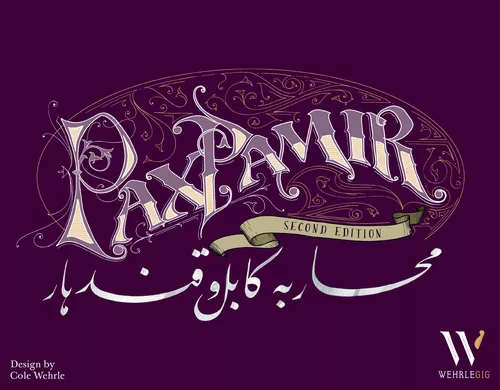
Early on, it was fairly clear that the final design would be somewhat ornate. For this reason, a muted design dominated by a single color, would probably bring out the title best. To establish proper contrast the color would either need to be quite light, or quite dark. After a few quick tests, it was clear that a lighter color wouldn't convey the seriousness of the game, so we headed to the darker end of the spectrum. Eventually we settled on purple as the dominant color. This was done for a few reasons. Pamir is, ultimately, a game about politics and the political suit in the game is purple. Purple has long associations in the region with the political order. This is mostly a vestige from Nader Shah's conquests of Afghanistan and the establishment of Durrani power in the eighteenth century. Shah Sujah, the last of the Durrani rulers, was frequently pictured in a purple robe. I also think purple is under-utilized in game design generally (especially for box covers).
:strip_icc()/pic4503733.png)
Originally, the plan was to use a flat color, with a handful of spot-UV highlights for texture and to emphasize the type. I felt strongly enough about this cover that I went ahead and published it on BGG and in a Kickstarter updated. The reception was mixed. A sizable portion of the audience reacted quite negatively, preferring, for one reason or another, a more traditional paper-texture or muted color. Purple just didn't seem appropriate for a game about Afghanistan.
I do my best to read each and every comment I can find about my work—both the good and the bad. I want to get better at what I do, and so I'm keen to hear from folks who think that I've done a bad job. I suppose it's a masochist impulse left over from graduate school. Anyway, all those comments led me to spend a few evenings reworking the cover and trying new designs. If there was a better design out there, I wanted to find it. I went through dozens of different color combinations, but I kept coming back to the initial design.
This was largely a good sign. Folks who follow my work know that I don't have any trouble tearing down things that I don't think are working. So, the resilience of the initial design meant something. At the same time, I realized that there were ways I could better communicate a time and place without abandoning the cover outright.
This was done in a few ways. First, I moved up the title and put in the peaks of the Hindu Kush mountains, as taken from one of Atkinson's lithographs. To set these mountains off from the background, put a light source behind them, which gave the cover a kind of stormy sunset vibe (one well-suited to the game's subject). I also decided to texture the box to give the purple just a bit of age and visual noise. Finally, I would alter the spot UV pattern to instead just highlight the gold decoration.
The result is, I think, a much stronger cover that, like so many things about the design, would not have been realized without the comments and criticisms of folks interested in the process.
:strip_icc()/pic4522550.jpg)